Roll-Over Example
 This basic tutorial will define the steps necessary to create a simple roll-over effect using an oval button with a gradient fill. We start by drawing an oval.
 The oval is given a gradient fill and the border is removed by setting the border thickness to zero.
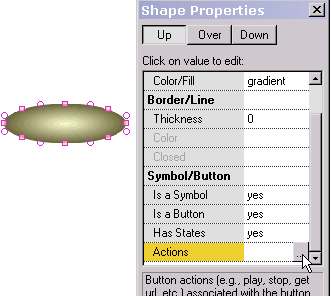 The oval is made into a symbol by selecting yes value for "Is a Symbol" (a necessary step before making the oval into a button). Then "Is a Button" is given a yes value. To produce a roll-over effect, the button must have an over button state (the appearance of the button when the mouse is over it), so "Has States" is given a yes value. Then the button's response (its actions) to mouse events is defined.
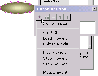 To achive a simple roll-over effect with no other action, Mouse Event is selected. If we want an action to occur when the button is pressed, we would select Get URL, Go To Frame or whatever the action is. We can have as many actions occur responding to mouse events as we like. But to achieve a simple roll-over effect which is our current task, we only need to select Mouse Event.
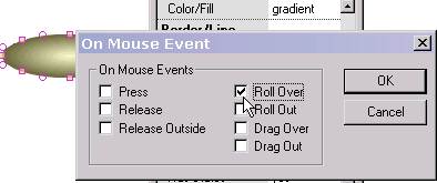
We check Roll Over. If we had a down state defined, we could check Release and/or Press as well.
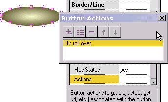 After pressing OK, we return to the prior popup and see the action we just defined in the list of button actions. By double-clicking on it we can edit the action. By selecting "+" we can add another action.
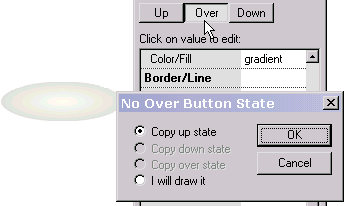
Now we are ready to define the over state of the button (the button's appearance when the mouse is over the button). We press Over at the top of the properties popup. Because the over state has not been defined, we are asked if we want to create the over state from another state we have created or if we want to draw it ourselves. We select to copy it from the up state (the button's appearance when the mouse is not over the button) which is displayed to the left in a dimmed silhouette to provide us with positioning information. If we had selected the last option to draw it ourselves, we would be free to draw any text or non-text shape. If we position the over state with an offset relative to the up state, when the mouse goes over the button while the animation is playing the button will shift in position reflecting that offset.
 To make the button's over state different than the up state, we change the gradient colors of the button's over state. We press the Up button at the top of the properties popup to exit the over state and we are ready to test the roll-over effect justed created.
 We select play in stand-alone player. With the mouse away from the button we see the gradient color associated with the button's up state.
 With the mouse over the button, we see the gradient color associated with the button's over state. Our test is successful!
To use as a navigation element, we could place text over the oval. On mousing over the text, the background oval would change color.